Saturday, August 8, 2015
Wednesday, November 2, 2011
Art Bootcamp
We're moving our blog discussions over to Art Bootcamp (http://artbootcamp.blogspot.com) and building our art tutorials, lessons and courses on our domain, ArtBootcamp.com.
Please, continue to follow us and join in!
Thank-you!
Please, continue to follow us and join in!
Thank-you!
Saturday, May 14, 2011
Saturday, January 8, 2011
Toward Complete Mastery – I
Let’s begin our studies by dispelling some common myths. There is no doubt that talent plays a great part in the creation of great art, but for the basics -- that is, the rudiments such as drawing and painting, the reality is that most of us can do it if we know how. It doesn't take any special skill or any special talent to be able to draw and paint a realistic image. Seriously....I'm not kidding! The basics of accurate drawing and accurate observation of values and colors and color mixing are crafts, and a craft can be learned by anyone.
 This Gary Larson cartoon shows God creating the snakes, but the myths surrounding the creation of heaven and earth has it that God for his very first act created light. And that's what we'll do -- okay we won't create light, but we will learn how to use it as an artist uses light. Light and shadow form the very basis of painting and drawing. Most people become victims of light, that is they accept whatever is given them. If the lights are on in the room…well, that's the light... no questions asked. So they get stuck with the light, usually they're also stuck with the models, along with being stuck with the position in which their easel is placed. No wonder they feel stuck.
The purpose of this introduction to lighting is to get us unstuck... and get us unstuck at the very beginning, at the point of light.
The best way to understand light is to have a controllable environment, and the most easily controlled environment for the artist is through using a shadowbox. A shadowbox is a relatively easy thing to build in your studio, especially with today's materials. For ours we will be using quarter inch FoamCor, which is readily available at most art stores. We want to use the black FoamCor, which is black on all sides and in the core. FoamCor is very sturdy stuff, easy to cut and work with. The box can be put together with tape.

We'll be making an open front box that will have the bottom, two sides, a back and a removable top. The top will have an opening over which we can place some diffusion screen and other pieces of FoamCor to vary the size of the opening. There's no special size to the box. You can make it any size that fits conveniently in your studio and accommodates the subjects you'll be using your still life. You can make a number of different sizes to accommodate different subjects.
For the materials you'll need to quarter-inch FoamCor, some tough diffusion screen -- it's called tough in the trade because it resists burning discoloring and wrinkling due to the heat from the light. The most popular company making gels and diffusion screens is Rosco. Gels and screens are handled by companies specializing in theatrical lighting. You can also get them online.
For the light source, get a simple stainless reflector. These are available at places like HomeDepot. Get a daylight bulb, about 5000 K. The bulb needn't be terribly bright, 50 W should be fine. After all we are lighting a very small area so we don't need a tremendous amount candlepower. Any bigger bulb will create too much heat, so I'd recommend something smaller along the lines of a 50 W -- start with that (those little screw-in fluorescent bulbs would be a good choice...as long as they are daylight bulbs). The reflector will be resting directly on the FoamCor at the top, that is on the roof or ceiling. You will cut an opening over which the reflector can be placed. As you can see in the diagram, the diffusion screen (if you choose to use one) is laid directly over the opening. You will also cut strips of the black FoamCor or matte board for use in narrowing the aperture, that is narrowing the opening.
This is where we will really learn about the nature of light, because it's not just about light, it's also about shadow. By manipulating the balance of light and shadow, and its quality, along with the type of edges that are produced, we will be mastering one of the most important skills the artist can have. The emotion that we produce in a picture is largely a result of the balance of light, shadow and edge. The nice thing about the light box is that it allows us to experiment. It's when you experiment with light that you begin to understand the emotional content you can create by manipulating the light and the shadow.
 In this first example, we want to make the pears look round and have weight. Here we use a wide aperture. The reason for that is to have some of the light spill into the shadow. This creates a more open shadow, and that lack of contrast makes it less dramatic -- we're not looking for drama in this picture. We've also added a diffusion screen... and this is described in terms of how much light it absorbs in making the diffuse light. In this case, it's a full camera f-stop. We've positioned the aperture directly above the bowl of pears and that's what creates, what I like to think of as, a friendly light... nothing too dramatic, but all of the information is right there for the viewer to take in.
 In this next example, the bottle of olive oil is much more dramatically lit than was the bowl of pears. Also, here's something so few people do with a shadowbox, again it goes back to being stuck. They all get stuck on a black box. They don't change it, when all they have to do is to add a little bit of drapery in the background, or something on the floor. In this case, we added a bit of wood paneling. Very simple. Because the paneling is light, it's reflecting light back into the subject, this is very important in the case of glass, as it is the light that defines the content.
By making the aperture very narrow, and aimed somewhat behind the pitcher of oil, we've produced a lighting situation with much higher contrast than the bowl of pears. Also note, that we're not using a diffusion screen. What we've made is a thin sliver of raw light, and that's what produces the sharper edges, the sharper highlights and the sharper shadows.
This is the very first lesson on gaining mastery over art. As the cartoon shows, it's easy once you know how. And knowing how begins with an understanding of light and shadow. By making your own light and shadow you are no longer a victim of whatever light happens to be offered.
Wednesday, July 14, 2010
The Elusive Ellipse
By far, the most common problem artists encounter in drawing is with unconvincing ellipses. The most common mistakes are to make them football-shaped, frankfurter-shaped or flat on one side, like a loaf of bread.
An ellipse is no more than the visual description of a circle viewed from different angles. Hold a dinner plate straight up and it's circular. But lay it down, it becomes elliptical until, viewed from the edge, it becomes a straight line. This is why the lip of a tall water glass is a very different ellipse than the base viewed from exactly the same angle. Even more to the point is liquid level is also different...partway between the ellipses of the base and of the lip.
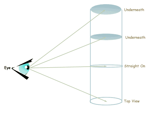
By defining your ellipses perfectly, you can make a drawing of a wine glass and define exactly where in the visual plane it is ... whether the viewer is above of below. The effect is so powerful that it defines the space surrounding it, making it (in your mind's eye) go back in space in a specific dimension, even though that is implied.
Obviously, mastering ellipses is a powerful tool for the artist. Once you understand how ellipses are formed, you will be able to bring that knowledge to freehand drawing. What follows are two methods for making accurate ellipses and their value for you will be in that you will understand the underlying mechanics, not that you’ll often use these methods in you day-to-day drawing. Still, for those times when there’s a little something wrong with an ellipse, the second method is what you can use to check and correct.
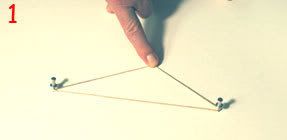
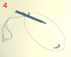
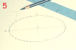
STRING METHOD: this is the best known method for making ellipses. It’s moderately accurate but of greatest benefit when you need to draw large ellipses. Here’s a chance to do Crop Ovals, amaze your neighbors and get written up in The Enquirer!
Tie a piece of string so when the loop is pulled tight it is approximately to the width of the ellipse. Put a pin in the surface of whatever it is that you are drawing on. Then put the second pin inside the loop and move it so that, stretched from the center, it forms a triangle with the top approximately one-half of the height. Obviously this is all approximate because as you make the height taller, you draw in the sides.
Select any spot on the string. Don’t worry because you’ll be coming back to exactly that spot. Keeping a steady pressure on the string, using it as a guide and holding your pencil absolutely vertical, simply follow the string where it leads you and where it allows you to go.
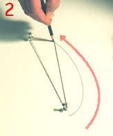
As you can see, the hand is holding the pencil vertically throughout. Simply follow where the string leads you. In this case we used a waxed string. We had started with a thicker string but it kept tangling the pencil. It’s also important that the string you use will not stretch. That will distort the ellipse.
THE DOT METHOD: this is a bit more complex but far more accurate. It had been mentioned that this is one of those bits of arcane knowledge known to only to illustrators and cartoonists. It’s almost completely unknown in fine arts departments. Now we will reveal it to painters!
Imagine, in the string method, that we drew a line the longest horizontal axis (where the pins were). Now imagine that at the top of that triangle we had formed, we dropped a vertical line, intersecting at 90°. It’s those crossed lines that will form the basis of what we are about to do.
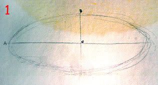
The first thing we did was to rough out the ellipse we want to end up with. Then we rough in the horizontal and vertical lines. In this case, we later sharpened the lines and made an accurate 90° intersection with a straight-edge. Then we label the center with a C (pretty clever, eh?). We then label the horizontal line with an A and the vertical with a B (sorry, no more cleverness).
On a strip of paper, we mark the distance from C to A and from C to B. They will always appear in this order C-B-A.
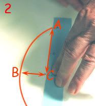
Now we line up B on the horizontal and A on the vertical. Wherever C hits, make a dot.
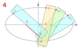
In this diagram you can see how the strip is slid along, always aligning A and B with the horizontal and vertical, and always making a dot where C lands. A few minutes of practice is all it takes.
As you can see, this is a very accurate method of describing ellipses. All that’s left is to connect the dots. No matter if they are horizontal, vertical or diagonal, if an ellipse gives you trouble, you can always use this method to insure that it will be accurate.
An ellipse is no more than the visual description of a circle viewed from different angles. Hold a dinner plate straight up and it's circular. But lay it down, it becomes elliptical until, viewed from the edge, it becomes a straight line. This is why the lip of a tall water glass is a very different ellipse than the base viewed from exactly the same angle. Even more to the point is liquid level is also different...partway between the ellipses of the base and of the lip.
By defining your ellipses perfectly, you can make a drawing of a wine glass and define exactly where in the visual plane it is ... whether the viewer is above of below. The effect is so powerful that it defines the space surrounding it, making it (in your mind's eye) go back in space in a specific dimension, even though that is implied.
Obviously, mastering ellipses is a powerful tool for the artist. Once you understand how ellipses are formed, you will be able to bring that knowledge to freehand drawing. What follows are two methods for making accurate ellipses and their value for you will be in that you will understand the underlying mechanics, not that you’ll often use these methods in you day-to-day drawing. Still, for those times when there’s a little something wrong with an ellipse, the second method is what you can use to check and correct.
STRING METHOD: this is the best known method for making ellipses. It’s moderately accurate but of greatest benefit when you need to draw large ellipses. Here’s a chance to do Crop Ovals, amaze your neighbors and get written up in The Enquirer!
Tie a piece of string so when the loop is pulled tight it is approximately to the width of the ellipse. Put a pin in the surface of whatever it is that you are drawing on. Then put the second pin inside the loop and move it so that, stretched from the center, it forms a triangle with the top approximately one-half of the height. Obviously this is all approximate because as you make the height taller, you draw in the sides.
Select any spot on the string. Don’t worry because you’ll be coming back to exactly that spot. Keeping a steady pressure on the string, using it as a guide and holding your pencil absolutely vertical, simply follow the string where it leads you and where it allows you to go.
As you can see, the hand is holding the pencil vertically throughout. Simply follow where the string leads you. In this case we used a waxed string. We had started with a thicker string but it kept tangling the pencil. It’s also important that the string you use will not stretch. That will distort the ellipse.
Here’s the final ellipse. It’s pretty accurate and took all of a couple of minutes. This is definitely the method to use when you need to make large ellipses to fit a specific area.
THE DOT METHOD: this is a bit more complex but far more accurate. It had been mentioned that this is one of those bits of arcane knowledge known to only to illustrators and cartoonists. It’s almost completely unknown in fine arts departments. Now we will reveal it to painters!
Imagine, in the string method, that we drew a line the longest horizontal axis (where the pins were). Now imagine that at the top of that triangle we had formed, we dropped a vertical line, intersecting at 90°. It’s those crossed lines that will form the basis of what we are about to do.
The first thing we did was to rough out the ellipse we want to end up with. Then we rough in the horizontal and vertical lines. In this case, we later sharpened the lines and made an accurate 90° intersection with a straight-edge. Then we label the center with a C (pretty clever, eh?). We then label the horizontal line with an A and the vertical with a B (sorry, no more cleverness).
On a strip of paper, we mark the distance from C to A and from C to B. They will always appear in this order C-B-A.
Now we line up B on the horizontal and A on the vertical. Wherever C hits, make a dot.
In this diagram you can see how the strip is slid along, always aligning A and B with the horizontal and vertical, and always making a dot where C lands. A few minutes of practice is all it takes.
As you can see, this is a very accurate method of describing ellipses. All that’s left is to connect the dots. No matter if they are horizontal, vertical or diagonal, if an ellipse gives you trouble, you can always use this method to insure that it will be accurate.
Monday, April 26, 2010
Republishing some books
After almost 20 years in print, The Illustrators Bible has finally gone out of print. If we are to judge by the astronomical prices for Gouache For Illustration on the used book market,(which went out of print several years ago) Bible will surely follow.
Having seen ridiculous prices for Gouache, with single copies over $400. I realized that everyone was making money except for me, the author. Fortunately we now have the technology to put it back in my hands. I will be working with a branch of Amazon to produce high-quality reprints. Because they are custom printings, they will be more expensive than the originals (which were $29.95 and $24.95 respectively). We have not arrived at the final price point but you can figure on about twice the cover price.
In the years since writing those books, I have learned new things, technology and resources have changed and the old books don't reflect those changes, so I am updating and upgrading both of them. These will be expanded with new text and illustrations.
Additional to the custom printed editions, we are working on a more economical downloadable version that might (perhaps) include a few videos where needed to amplify the information.
As many of you know, gouache is my favorite medium. In the book, I purposely did what I do when teaching…avoid showing off. I left that for John Ball and Dan Tennant to do…and they really shone as the masters of the medium they had become. It is only natural that in the intervening years my skill sets should have improved. So in this revised edition of Gouache, I have decided to show what the medium can do when I pull out all the stops. There will be examples of work done in my professional practice and some done for no other reason than to enjoy what a brush and paint can do.
As is typical of my recent work, most of my pictures are done small and shown enlarged. This is one of my dragons and he’s loaded with texture. It’s really quite a simple approach with never more than three tones on any rendered area (most of the scaly texture is just two tones…highlight and shadow). The message I can impart is that the simpler the rendering, the more illusionistic it becomes.
The accompanying dragon study is one of the new illustrations that will be added to the revised book and the digital book.
Tuesday, December 22, 2009
The Curious Case of Cobalts
The following series of observations are something that could not occur from quoting books and articles. When you’re surrounded by several tons of pigments and hundreds of gallons of paint, you see things differently than a person with the average palette. That’s what has evolved recently and our findings will be of use to the serious painter.
Cobalt pigments are classified as synthetic inorganics. Unlike naturally occurring mineral inorganics, cobalt pigments do not naturally occur but must be made by calcining (firing at very high heat). Also, unlike modern organic pigments, cobalt pigments are not carbon-based.
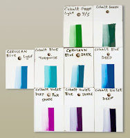
What became apparent over years of making paints is that every cobalt pigment mixed nicely with any other cobalt pigment. Unlike so many combinations, the mixes never became muddy or dull. Of interest to artists is the wide range available of cobalt colors.
Cobalt produces the most diverse range of pigments currently available in artists' paints: its colors range from cobalt violet through several shades of cobalt blue, two shades of cobalt turquoise, several varieties of cobalt green, cobalt yellow and even a grayish cobalt black. Cobalt pigments tend to be semitransparent, moderately saturated, and very permanent.
All reflect a noticeable amount of light from the red spectrum making for warm yellows, violets and blues, but rather dull greens and turquoises; the greenish compounds with chromium become steadily duller and more opaque as the proportion of chromium is increased.
That dullness is not a bad thing. Indeed, it’s quite useful on the palette, not overpowering mixes as the Pthalocyanine colors do.
While the mixtures among the Cobalt family are very useful, what we found is these paints are at their best when used with other colors outside the Cobalt family. Any mixture of Cobalt Turquoise, Cobalt Violet (Red Shade) and Cadmium Orange Light produces unusually vibrant mixes. Chromium Green Deep and Zinc White produce a tint that can be used in some sections of a sky and definitely in depicting water, trees and most landscape elements.
As with Zinc White being the mixing white, the Cobalt family of colors can be the mixing colors. You won’t go wrong with them.
Subscribe to:
Posts (Atom)

